A Little Paint Can Go a Long Way: Choosing Colors for Your South Jersey Home
By Derek Doernbach, REALTOR® | Century 21 Action Plus Realty | Your Jersey Shore Team
Published October 20, 2026 · Updated October 22, 2026
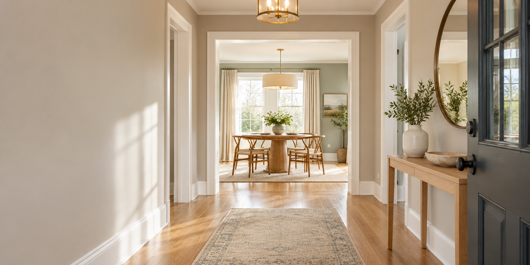
Should you paint before selling your South Jersey home? The honest answer is that it depends on the home, but thoughtful paint can change how a property presents. The color matters less than fit: how well a shade works with your floors, trim, and natural light. This guide covers when painting earns its keep, which colors are worth a look in 2026, and how to choose around what you are keeping.
Paint & Room Studio
Don't Just Imagine It. Explore the Possibilities.
Before you buy a gallon, visit my Paint & Room Studio. Answer a few questions, explore colors from four paint brands, and compare wall colors and flooring options in five sample rooms. Save your favorites and print a project card to take to the paint store.
Try the Paint & Room StudioFree to explore. No signup required. Digital colors and material previews are approximate—always test physical samples in your home.
This guide began with a conversation with my friend Sophie Ricci, a team leader and broker associate with SRG Properties Group–Century 21 North East in Norwood, Massachusetts. Sophie recently helped a client by painting a room herself. That hands-on gesture got us talking about how a relatively small improvement can change the way a home feels—and how paint choices should respond to the home, its surroundings, and the people considering it.
What Fresh Paint Can Actually Do
Fresh paint creates a clean, cohesive appearance, refreshes scuffed or worn surfaces, and makes a room feel more intentional. Those details matter when buyers form impressions in the first minute of a tour.
It is just as important to know when painting is not necessary. If walls are already in good condition and neutral, repainting may add little. A careful cleaning and a few patches can do more in some rooms than a full repaint.
Beige, Gray, and Greige in 2026
Warm neutrals are receiving real attention. Sherwin-Williams chose Universal Khaki SW 6150, a warm, grounding neutral, as its 2026 Color of the Year, and explains the choice in its 2026 color discussion.
But a trend is not a local buyer survey. Manufacturer color announcements are design inspiration, not proof of South Jersey buyer preferences or resale returns.
Gray is not universally outdated, and a warm gray can still look current in the right room. Greige, the blend of gray and beige, remains a useful bridge: warmer than a cool gray, quieter than a golden beige. Sherwin-Williams explains the family in its greige color guidance. What matters is undertone, light, and the finishes it sits beside.
Start with What Stays in the Room
Choose wall color around the things you are not changing: flooring, cabinets, countertops, tile, trim, and major furnishings. In open-plan layouts, add adjacent rooms, because colors sharing a sight line should feel related rather than accidental.
Undertone, in plain language, is the subtle color cast under the main color. A beige can lean peachy or grayish; a white can read clean or creamy. Those casts show up only when a color sits beside other surfaces, so hold samples against your fixed finishes before you commit.
Light Changes How Every Color Reads
Natural light is the biggest variable. North-facing rooms get soft, steady light that can flatten cool colors; west-facing rooms get afternoon sun that makes warm colors glow. Bulbs matter too: warm bulbs bring out gold, cool bulbs bring out blue.
Surrounding surfaces act as reflectors, so the same gray can look different in a sunny kitchen and a shaded hallway. Paint generous samples on the actual walls and check them in the morning, afternoon, and evening with the lights you normally use.
Four Palette Directions to Sample
Treat these as editorial starting points, not formulas. Each deserves a real sample in your home before you buy a gallon.
Warm and Welcoming
Walls · Greige
A warm greige with an off-white trim suits living areas where you want an easy, grounded feel. Benjamin Moore’s Edgecomb Gray HC-173 with White Dove OC-17 trim is a well-known pairing. Sample it beside wood flooring and warm stone.
Soft Neutral Refresh
Walls · Off-white
An off-white with a subtle warm cast reads as fresh without shouting, and it works well in bedrooms, hallways, and connecting spaces. Benjamin Moore’s Pale Oak OC-20 with White Dove OC-17 trim is a place to start.
Subtle Coastal
Walls · Blue-gray
A quiet blue-gray can echo the water without full nautical styling. Sherwin-Williams’ Tradewind SW 6218 lives in this family and suits rooms with strong natural light. Coastal styling stays optional: the color can carry an airy feel on its own.
Nature-Inspired
Walls · Muted green
Muted greens bring a calm, organic mood to kitchens and bedrooms. Sherwin-Williams’ Liveable Green SW 6176 is a well-known example, but green is demanding: sample it beside cabinets, counters, and any stone or tile before committing.
The colors above are official manufacturer colors, each linked to the maker’s page. Cross-brand colors are not exact matches, and digital previews are approximate. Sample the actual product you plan to buy.
Curious How a Color Looks in a Room?
The Paint & Room Studio lets you compare colors from Sherwin-Williams, Benjamin Moore, Behr, and Valspar across five prepared scenes, flip between before-and-after views, preview lighting and flooring, and save favorites to a printable project card.
Open the Paint & Room StudioHow the Paint & Room Studio Works
The studio starts with prepared sample rooms: living room, bedroom, kitchen, bathroom, and entry or hallway. You explore colors from four brands, click through paint swatches, compare before-and-after views, and preview illustrative lighting moods and flooring options, including carpet. Saved favorites become a printable project card.
Two honest notes. The studio uses prepared rooms, so you explore realistic scenes rather than uploading your own room photo. Scenes keep their furniture and layout when flooring changes, and existing area rugs stay in place. Catalog coverage varies and includes historical entries, so not every current color appears in every scene, and previews are approximate.
South Jersey Homes: Work with the One You Have
Context shapes the right palette, not a rule about any town or county. As examples: an older home with warm woodwork often pairs well with warm neutrals; a contemporary open plan rewards cohesion across connected rooms; a shore property with strong light can carry a light blue-gray; and distinctive fixed finishes deserve a palette that responds to them. Coastal styling is never a requirement near the water.
Where to Focus Before Selling
Walk the house and prioritize. Visible wear, scuffed walls, and mismatched touch-ups stand out in photos and tours. Heavily personalized rooms are common candidates for a reset, and connected spaces benefit most from cohesion.
The reverse is also true: if a room is already clean and neutral, repainting may add nothing, and a repaint never requires replacing a good floor. A walkthrough with an agent who knows your market is the best way to decide where your effort counts.
Preparation and Finish Matter as Much as Color
Repair holes and cracks, clean the surface, and use primer when the manufacturer calls for it. Choose an appropriate product and sheen for each room, and follow the label’s application, ventilation, and drying instructions.
One line worth repeating: paint is not a way to conceal leaks, mold, or damage. Those issues need real repair, and honest disclosure, before any listing moves forward.
If the home was built before 1978, review the EPA’s Lead Renovation, Repair, and Painting Program guidance before disturbing painted surfaces.
Frequently Asked Questions
Should I paint before selling?
It depends on the home. Fresh paint earns its cost when walls are scuffed, worn, or painted in very personal colors. When walls are already clean and neutral, repainting often adds little. No paint job guarantees a higher offer; it improves presentation.
Is gray still a reasonable choice?
Yes. Gray is not automatically outdated. A warm gray or greige can look current and calm when it works with a room’s finishes and light. Manufacturer trends are design inspiration, not proof of local buyer preferences, so choose what suits the actual home.
What is greige?
Greige is a blend of gray and beige that sits between the two families: warmer than cool gray, quieter than golden beige. Its exact character depends on undertone and light, so sample it on your walls. Sherwin-Williams has a useful explanation in its greige color guidance.
Can the studio show my own room?
The Paint & Room Studio uses prepared sample rooms: living room, bedroom, kitchen, bathroom, and entry or hallway. You cannot upload a photo of your own room, but the scenes are designed to help you compare wall colors, lighting moods, and flooring options, including carpet, before you test real samples at home.
Where can I find the Paint & Room Studio?
It is a page on this site at /paint-room-studio/, linked from the buttons in this article and from the More menu on every page.
Your Next Step: See What Could Work
Explore your ideas in the Paint & Room Studio, save a few favorites, and test real samples at home. If you’re preparing to sell, I can help you decide which updates deserve your time and budget.
You can also find the studio any time under More → Paint & Room Studio in the menu.
About the contributor: this guide grew out of a conversation with Sophie Ricci, team leader and broker associate with SRG Properties Group–Century 21 North East in Norwood, Massachusetts. Learn more on her official profile or at SRG Properties Group.

Derek Doernbach, Realtor®
Derek has been helping homeowners throughout the Jersey Shore and South Jersey navigate real estate since 2016. A recipient of the New Jersey Realtors Circle of Excellence Award every year since 2019, he has closed 192 transactions and helps sellers, buyers, downsizers, and relocating clients make confident real estate decisions. More about Derek.
Sources & References
- Sophie Ricci’s official profile at SRG Properties Group, Century 21 North East, Norwood, Massachusetts.
- SRG Properties Group, the team website referenced in the guide.
- Sherwin-Williams: 2026 Color of the Year discussion, the manufacturer’s description of Universal Khaki SW 6150 as a warm, grounding neutral.
- Sherwin-Williams: Our Top 5 Shades of Greige, the manufacturer’s explanation of the gray-beige color family.
- EPA: Lead Renovation, Repair, and Painting Program, official guidance for safely disturbing paint in pre-1978 homes.